Introducing Dark Mode to LinkedIn
A Night and Day Difference

Introduction
Building on our design refresh, which aimed to bring to life our diverse, warm and welcoming community, LinkedIn’s Design, Product, and Development teams came together over the past year to bring Dark Mode to our 800M members around the globe.
We took a thoughtful approach to the overall Dark Mode user experience, particularly accessibility considerations, to ensure all members can be productive and successful on our platform regardless of their abilities. Members want to stay informed, engage in an active community, and find their next opportunity irrespective of day or night. In addition, we wanted to meet members in their environment and reduce anxiety by providing a UI that adapts.
Accessible and Inclusive from the Start
We ensured that our Dark Mode theme met accessibility standards by checking and adjusting all text and UI elements for their color and contrast to help reduce eye strain and those with light sensitivities, yet still easy to read.
We also focused on best accommodating the overall light to dark background contrast while staying mindful of how they may layer or interact with other elements. The Dark Mode design also builds upon our existing accessibility features, such as text scaling, device orientation and page reflow, and appropriately sized tap targets.
It’s All About Semantics
Once the design system Dark Mode theme was complete, we devised the design token system to support it. Design tokens are semantic labels or variables to a color or a set of style values. So instead of saying something is red (or #FF0000), we may define it as something like “signal-color-error” so that we have the flexibility to change the underlying values down the road along with what we selected in Dark Mode. So if we decide to change our “signal-color-error” from a safety red to a burnt orange color, we can easily make this change once and have it reflected throughout the system. Design tokens also pave the way to produce other themes later on.

Within LinkedIn, we have many discrete teams who design and build for our consumer apps, and we had to devise a plan to coordinate across all of them to roll this out consistently and holistically. We coordinated and ran sprints across the working teams and semantically updated over 10,000 color usages to deliver a cohesive Dark Mode experience across the consumer product. Along with this, our engineering team incorporated tools in the code to look for any non-design token values in order to maintain good hygiene in the future.
Illustrating for Darkness
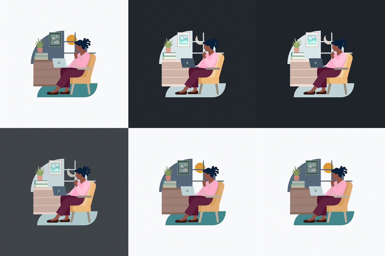
We also took this opportunity to introduce Dark Mode versions of our illustrations that complement the Dark Mode experience. These illustrations capture a wide variety of industries and fields beyond tech and represent professionals of all abilities and backgrounds, bringing our vibrant and diverse LinkedIn community to life. Our design systems team is consistently revisiting these and creating new illustrations representing inclusion, equity, and remote work, along with Dark Mode variations. There’s even a couple of fun easter eggs, such as showing the moon vs. the sun. The underlying infrastructure takes care of swapping out the illustrations.

Onward With Dark Mode
Our Design organization migrated over to Figma a couple of years ago. Figma is a cloud-based design tool that has been invaluable for our teams to collaborate while working virtually. Figma allows our teams to constantly be in sync with the latest updates to our design system and shared design patterns, regardless of where we are in the world or what time it is. This connectedness helps us continuously keep our design tokens updated as we continue to enhance the Dark Mode experience for our members.
We’ve also developed our own Figma plugins to help the team select inclusive personas, consider different language word lengths, spec’ing for accessibility, and now preview their designs for Dark Mode. This new Figma plugin allows designers to focus on designing in light mode and then easily toggle over to preview it in Dark Mode.
These investments in the tools our designers use every day help keep the team focused on building the best experiences for our members.

Available on a Screen Near You
We’re excited to announce that we’ve fully rolled out Dark Mode on mobile to our members across the globe. In addition, desktop web support will be made available to everyone in the next month.

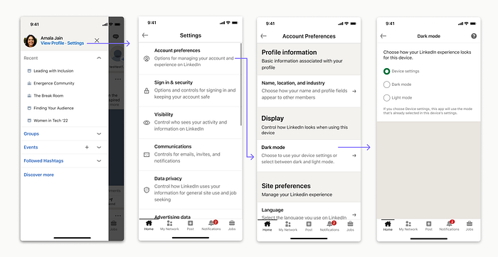
To enable Dark Mode on your mobile device, first, ensure your app is up to date. Next, head into the app’s settings by tapping your profile picture in the upper-left corner of the screen, then choose Settings in the header section. Then in Settings, choose Account preferences > Display / Dark mode. From this Dark mode settings screen, you can then choose to inherit your operating system’s (Android / iOS) dark mode display settings or have dark mode always on (or light mode always on) within your LinkedIn app.
I’m thrilled to have been a part of making this much-requested feature a reality for our members and want to thank everyone that helped Dark Mode come to light. We hope you all are just as excited to start using it.
If you’d like to work on initiatives such as this and bring valuable features to our members and customers, join us! Our Design team is hiring. design.linkedin.com
I want to thank the many of those in Design, Engineering, and Product that helped in this initiative. This project was undoubtedly a team effort spanning multiple teams. Thank you to everyone that helped and contributed to Dark Mode!
Originally published at https://www.linkedin.com.
